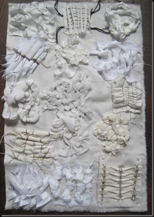
Design from Landscape
It is not ideal to skip chapters (and go back later) but I have a tutorial next weekend so hope to discuss the design of my end of module resolved sample.As my design source is taken from cliffs and rocks I have decided not to introduce any colour but to keep to shades of black, white and brown.
Flat textures
– I chose to use bleach on black paper for this exercise.


Images 11.1.1 – 11.1.8
Relief textures

Image 11.2.1 – sample ideas


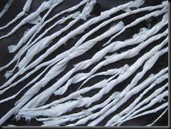

Images 11.2.2 – 11.2.5
I have brushed some diluted walnut ink over these samples
Use of shape
Original image together with the divisions in white stuck to black paper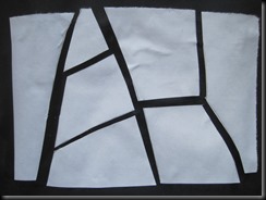

I like this and think it could be used for this project


Whilst this was one of my favourite images I think the divisions are too complex for the project

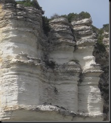
Again I do love this image but there are too many sections


This is also a possibility but making fewer sections – see below


Images 11.4.1 & 11.4.1a using decorated papers


Images 11.4.2 & 11.4.2a – using decorated papers
